Taxonomy is a key part of the navigation that aids customers in finding the product they are looking to research or buy. There are different best practices that should be considered when a taxonomy is being built or maintained to make sure it provides as much efficiency as possible to help aid in successful user experience.
If you customers can’t find it, they can’t buy it. Help them by making your navigation taxonomy intuitive, concise, and efficient.
#1 Avoid Attribute Stuffing
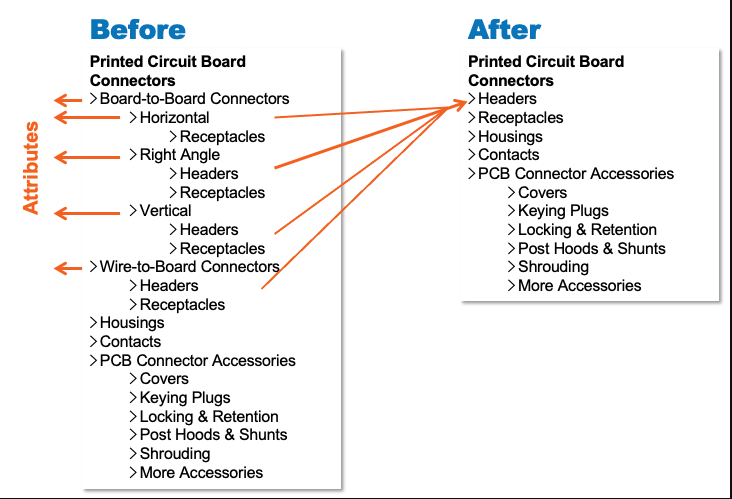
One of these best practices is to avoid attribute stuffing. Attribute stuffing is the practice of including attribute values or specifications in the category labels. If you are shopping for sweaters and the categories are broken out by material like [Wool Sweaters] and [Cotton Sweaters] then you have to go into both categories to see all sweaters. If the material isn’t the key attribute you are using as a differentiator, then this can be frustrating. Material is better served as a filter at the category level.
In the illustration below we see another example of this. The attribute for orientation is used in the taxonomy with [Horizontal], [Right Angle], and [Vertical]. This has forced the customer into a filtered set of products and that particular attribute may not be important. It also adds noise to the taxonomy. Its best to keep the taxonomy as simple and concise as needed to make for quick and efficient scanning of categories. This adds noise both vertically and horizontally. The taxonomy unnecessarily goes down to a third level when it could have been a two level click hierarchy. The best way to serve the customer is use is-ness in the taxonomy without attribute stuffing and use filters to allow customers to reduce the number of products they way that best suits their needs.

#2 Keep Your Taxonomy Concise and Efficient
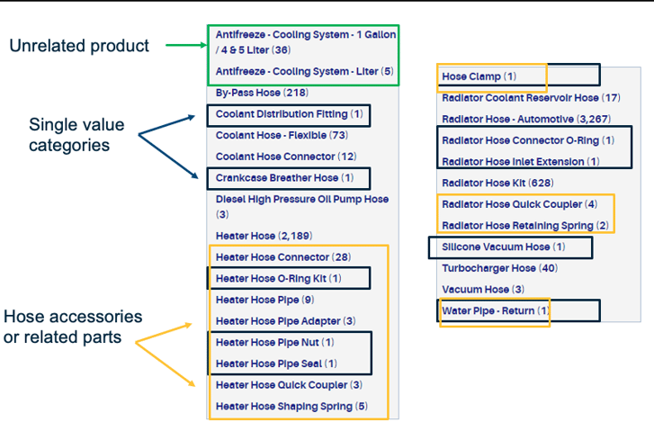
As mentioned in the previous tip, its best to keep your taxonomy concise and efficient. There are many ways to make your taxonomy more efficient. Single value categories should be avoided if there is logical way to group them. Many times, these single value categories are parts or accessories to the primary categories in that particular branch of the taxonomy. Accessories can be grouped together to make the taxonomy more efficient. Sibling categories that don’t fit should be taken out an put in either its own branch of the category or in a branch that makes more sense. Below we see an [Antifreeze Cooling System] category mixed with [Hoses] and various small parts. It doesn’t quite fit with the others. This taxonomy below can be reduced to [Hoses] and [Hose Accessories] and perhaps another layer of taxonomy under [Hoses] if the products are different enough.

#3 Avoid Junk Drawer Categories
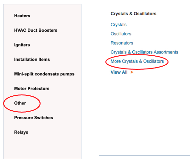
The last tip we are going to cover to make for a successful navigation taxonomy is to avoid junk drawer categories. These are categories with ambiguous names such as [Other], [Miscellaneous], [More], and [Additional Products]. It is not clear what might be in these taxonomic buckets, so they are largely ignored. Products here have far less conversion. This often occurs because the category for a new product doesn’t exist, or they are secondary products, and it was felt that the effort to modify the taxonomy wasn’t warranted. Its best to have a governance process in place when product is onboarded and when a new category is necessary so that these junk drawers can be avoided. If the customer does go down the [Other] rabbit hole and they do not find what they were looking for, this will also frustrate them. We want to make the taxonomy intuitive and junk drawers hinders this efficiency.
I hope these tips help as you are building or maintaining your taxonomy. Taxonomy testing is a great way to flag areas in your navigation taxonomy that may be problematic. If you customers can’t find it, they can’t buy it. Help them by making your navigation taxonomy intuitive, concise, and efficient.

This article originally appeared on the Magnitude Software blog. Read it here.
